
MYFRIDGE
Duration: 1 month
My Roles:
UX Designer
UX Researcher
My Responsibilities:
End-to-end Design
Research
Prototyping

OVERVIEW
MyFridge is an iOS application with an Apple Watch addition that was created with the intention of solving the problem of food waste. By creating a tracking and reminder system, the user is able to monitor the freshness of their foods. This also allows them to become more conscientious of their consumption habits.
PROBLEM
This app was looking to solve the problem of users purchasing food and having it go bad after they forgetting about it. The goal with this app was to get the user to become consistent in finishing their food before it expired. This in turn would reduce the amount of food being wasted.
MY ROLE
For this project, I was responsible for the end to end design along with the user research. Additionally, I was responsible for the creation of the brand’s design and overall look. Prototyping and usability testing were also implemented at the end of the process.
PHASE 1: RESEARCH
COMPETITIVE ANALYSIS

Competitive analysis was done with five food delivery services to see how they stacked up against one another. One of the main trends that was observed was the use of alternative delivery/pickup methods. On the flip side, many of the apps had limitations when it came to product availability. This meant that users were only able to order products that were available on that platform.
USER SURVEY
To gain a better understanding of food storage practices, a user survey was conducted. 12 responses were collected and the main takeaways can be found below.
41% of the participants found themselves throwing their food out ‘often’ and 33% chose to ‘sometimes’
In terms of the criteria used to determine when to toss it, the majority of the responses (66%) said that they waited until they saw visible changes like mold to make the decision
About 40% of the respondents were relying on labels to gauge whether or not the food was still good. 33% of the respondents took a more relaxed approach to this by relying on their senses to keep track (vision and smell)
Due to limited time, I was only able to do one round of questions. If that wasn’t a factor, another round of testing would have been completed to expand on certain answers. For example, if bread goes bad once, does the user keep that in mind when they purchase it again? Do they make a conscious effort to remember the second time around?
EMPATHY MAP

Using the results from the survey, an empathy map was created. The map displayed the main sentiments regarding food waste and food storage habits. The main pains that came up were about frequently having leftovers as well as having to deal with over preparing meals.
PHASE 2: DEFINE
PERSONA

Data from the user survey was compiled and analyzed to create this user persona. Their main goals were to use the food before it expired while also reducing the amount of leftovers.
USER FLOW

For the user flow map, I chose to go with a scenario where the user added the food that they purchased to their fridge. Then, they would set a reminder for themselves on items of their choosing.
PHASE 3: DESIGN
SKETCHES

To kick off the design process, I started by sketching different ideas for the app’s home screen. Eventually, I settled on the first sketch which kept the search and notification icons in the top navigation bar and showed tiles for the different foods in the fridge. Other sketches that were created were individual food screens along with a notification screen for all of the user’s alerts. Sketches were also done for the smartwatch interface with the short look (the icon and alert) versus the notification with buttons.
WIREFRAMES

Mobile applications like Instacart were used as inspiration for the wireframes for MyFridge. The home screen was meant to act as the user’s “fridge” and display the foods the users were tracking. The second frame was an individual food screen and the third was the user’s reminder screen.
STYLE GUIDE
For the branding process, I chose the fridge icon to be the application’s emblem. The chosen colour palette was picked for both its vibrancy and versatility. The colours also worked since they noted the freshness status of all of the items in the fridge.

When choosing the typefaces for the mobile and watch interfaces, I made sure to adhere to the Human Interface Guidelines for iOS 14. The typefaces chosen were SF Pro and SF Compact.

PHASE 4: TEST
USABILITY TESTING

Using Figma, a prototype was created and then users were tested on how they navigated the application. Testing proved to be successful and all participants were able to complete the tasks with little to no difficulty. During this testing session, feedback was also collected on the smartwatch frames. The main takeaway was that it was important to be intentional about how information was shown due to the small display.
FINAL UI
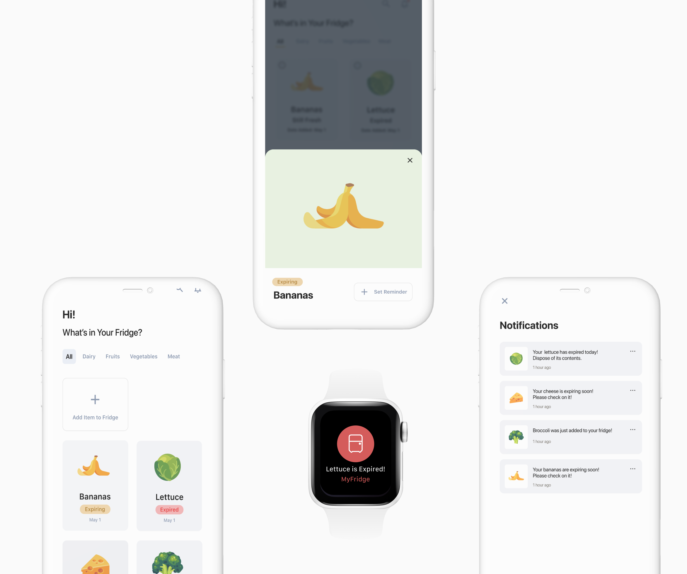
For the final visuals, the initial screens were more refined. Animations of the food were paired with chips on the screens. The chips noted the freshness of each item along with the purchase date directly below. For the individual food screen, a bottom sheet was created that let the user swipe it open and closed with ease. This element replaced the original reminders screen since the user would be able to see their alerts on the individual food screens. For the final watch screens, the colour was altered to match the messaging of the alert.
CONCLUSION
The next steps for this project would be to flesh out the watch/phone interoperability. Initially, I had hoped to add on a feature that would suggest recipes for food that was expiring. Additionally, I would have expanded on the delivery feature for the app. The hope would be to have users replenish their fridge through a grocery app when food was low.
In the end, I am very satisfied with the outcome of this project and am hopeful that I may have the chance to continue to work on it in the future.