
FULLSCRIPT WEBSITE BUTTONS WEB PAGE REDESIGN
Duration:
3 months
My Role:
UX Designer
My Responsibility:
UX Design

CONTEXT
Fullscript is a healthcare platform for practitioners and their patients. The platform allows practitioners to create online stores where they can sell supplements. Website buttons were created in order to give practitioners materials to promote their Fullscript stores to their patients.
PROBLEM
The current page for the website buttons has a lot of components on it and is in need of a new layout so that it is easier for the user to navigate. The website buttons are also on a separate page from the medical integrations which means that the user needs to go back and forth between two pages.
GOALS
Update the appearance of the current website buttons page to make it more appealing for the user
Present the user with a wider amount of website buttons options
Create another page that would have both integrations (medical and website) in the same place after redesign has been implemented
DESIGN PROCESS

First iterations of the website layout
For this project, I was the Primary Designer along with a Tech Lead, Product Manager and two Engineers. Starting off with the initial designs, I did exploration work in the platform’s staging environment to find different examples of navigation design patterns. This was beneficial since the user would be going back and forth between the medical and website integration pages. From there, I began to iterate on a handful of designs showing different navigation styles. Since practitioners don’t like having multiple tabs open, it was important to make sure that they would be able to switch back and forth between pages with ease. I explored the idea of having a navigation bar on the left and also having the tabs placed at the top of the page.
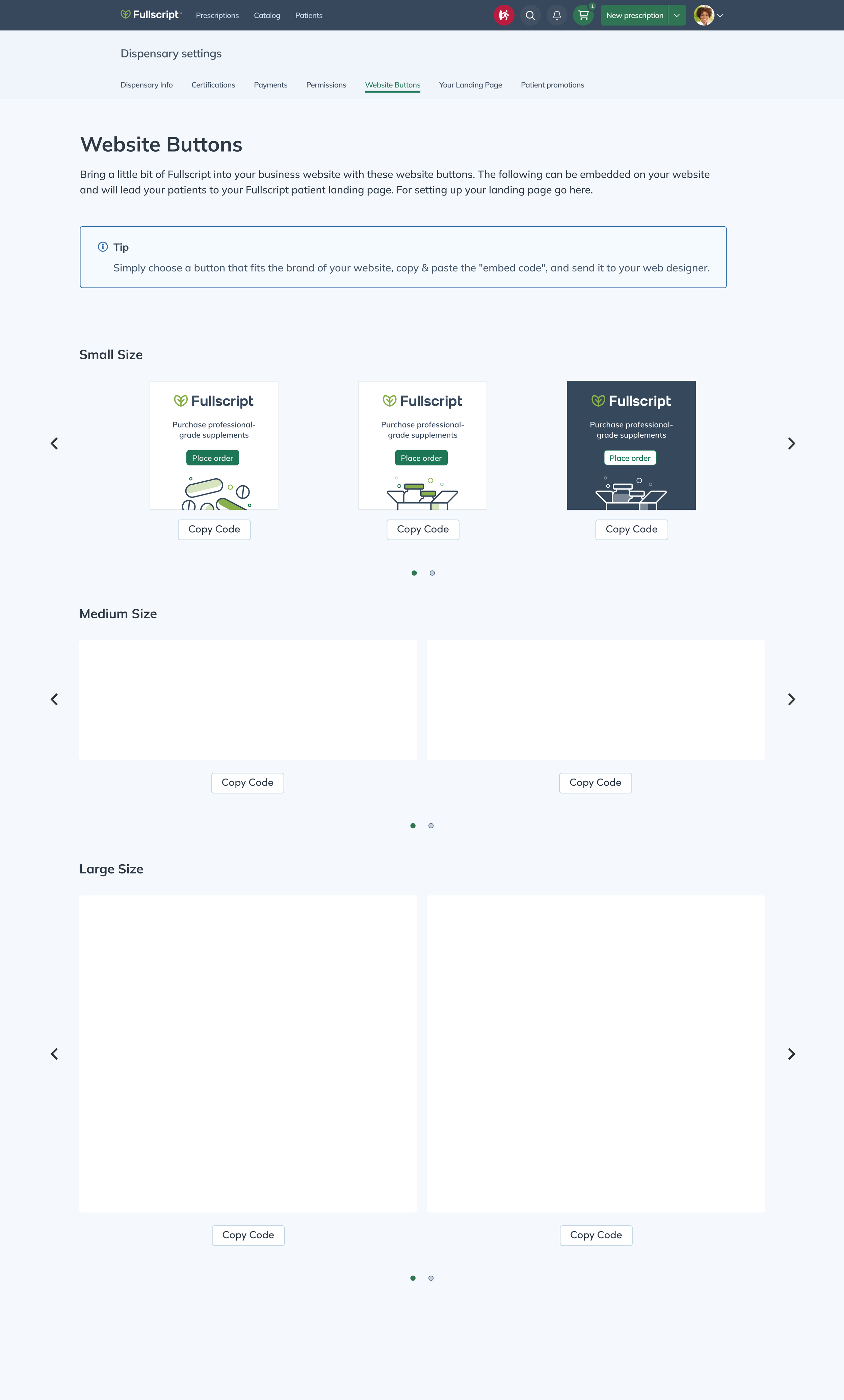
Layout using carousels to display buttons
After getting feedback from my team on the initial designs, I elected to move forward with keeping the tabs at the top of the page since it would be easier for the user to see. On top of the navigation, I also iterated on different ways to display and organize the website buttons. At this time, I only had the images for the small website buttons so placeholders were used for what was missing. One of the layout designs that I explored and ultimately chose was carousels. I went with this design pattern because I felt that it would be an easy way for the user to view all of the options.
When it came to organizing the buttons, I thought about trying to categorize them in terms of colour and website types. I tried out a dropdown menu for filtering out options but in the end, I decided against it when I realized that there were not enough options for it to be feasible.
FINAL UI

Final UI showing (l-r) the integrations page, the redesigned website buttons page and the preview module
For the final UI, I received all of the website button images and was able to incorporate them into the designs. In addition to the buttons, I also received banners and ended up having to adjust the layout to accommodate for their different shapes. These new changes also meant that the carousel was no longer relevant in the designs. Since there were so few options for the user, it did not make sense to keep these patterns. A module was also created so that when the user selected the copy button, they could see a full preview of the button.
Metrics from the updated page have not been made available at this time but with that being said, there are three potential things that can be measured. These metrics are: are practitioners interacting with the page? Which images are loading on practitioner websites? And how much traffic are the new buttons generating to the landing pages? The last is considered the most important as it’s what leads to patients signing up and purchasing items.
NEXT STEPS
Due to time constraints, the team only moved forward with the updated version of the website buttons page. However when time permits, the team will tackle creating the integrations page where the medical and website integrations will live.